预览效果: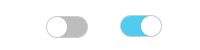
展示地址:https://jsbin.com/fanova/edit?html,css,output
1
2
3
4
5
6
7
8
9
10
11
12
13
14
15
16
17
18
19
20
21
22
23
24
25
26
27
28
29
30
31
32
33
34
35
36
37
38
39
40
41
42
43
44
45
46
47
48
| <!DOCTYPE html>
<html lang="en">
<head>
<meta charset="UTF-8">
<meta name="viewport" content="width=device-width, initial-scale=1">
<title>测试</title>
<style>
.switch {
display: none;
}
.switch-label {
display: block;
width: 40px;
height: 20px;
border-radius: 20px;
box-shadow: #CCC 0 0 0 1px;
background: #BDBDBD;
position: relative;
}
.switch-label::before {
content: '';
display: inline-block;
position: absolute;
left: 0;
width: 20px;
height: 20px;
border-radius: 20px;
background-color: #FFFFFF;
z-index: 20;
transition: all 0.5s;
-webkit-transition: all 0.5s;
}
.switch:checked + label.switch-label::before {
left: 20px;
}
.switch:checked + label.switch-label {
background-color: #51CCEE;
}
</style>
</head>
<body>
<input type="checkbox" name="switch" id="switch" class="switch"/>
<label for="switch" class="switch-label"></label>
</body>
</html>
|
预览效果: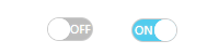
展示地址:https://jsbin.com/vokinuh/edit?html,css,output
1
2
3
4
5
6
7
8
9
10
11
12
13
14
15
16
17
18
19
20
21
22
23
24
25
26
27
28
29
30
31
32
33
34
35
36
37
38
39
40
41
42
43
44
45
46
47
48
49
50
51
52
53
54
55
56
57
58
59
60
61
62
63
64
65
66
67
68
69
70
71
72
73
74
75
76
77
78
79
80
81
82
83
84
85
86
| <!DOCTYPE html>
<html lang="en">
<head>
<meta charset="UTF-8">
<meta name="viewport" content="width=device-width, initial-scale=1">
<title>测试</title>
<style>
.switch {
display: none;
}
.switch-label {
display: block;
width: 40px;
height: 20px;
border-radius: 20px;
box-shadow: #CCC 0 0 0 1px;
background: #BDBDBD;
position: relative;
}
.circle {
position: absolute;
top: 0;
left: 0;
width: 20px;
height: 20px;
border-radius: 50%;
background-color: #FFFFFF;
transition: all 0.5s;
-webkit-transition: all 0.5s;
}
.text {
line-height: 20px;
font-size: 10px;
color: #FFFFFF;
text-shadow: 0 0 2px #DDDDDD;
}
.on {
display: none;
text-indent: 2px;
}
.off {
display: inline-block;
text-indent: 20px;
}
.switch-label::before {
content: '';
display: inline-block;
position: absolute;
left: 0;
width: 20px;
height: 20px;
border-radius: 20px;
background-color: #FFFFFF;
z-index: 20;
transition: all 0.5s;
-webkit-transition: all 0.5s;
}
.switch:checked + label.switch-label .circle {
left: 20px;
}
.switch:checked + label.switch-label .on {
display: inline-block;
}
.switch:checked + label.switch-label .off {
display: none;
}
.switch:checked + label.switch-label::before {
left: 20px;
}
.switch:checked + label.switch-label {
background-color: #51CCEE;
}
</style>
</head>
<body>
<input type="checkbox" name="switch" id="switch" class="switch"/>
<label for="switch" class="switch-label">
<span class="circle"></span>
<span class="text on">ON</span>
<span class="text off">OFF</span>
</label>
</body>
</html>
|
 支付宝打赏
支付宝打赏
 微信打赏
微信打赏